

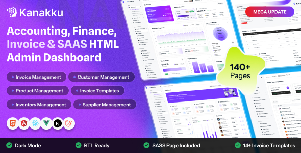
Kanakku is a modern, responsive admin dashboard template designed with Tailwind CSS v4. It is built on Vite with reusable HTML partials, a design-token based theme, Preline interactive components and a set of pre-styled UI building blocks, so you can start building your own pages quickly.
Kanakku is a clean, modular Tailwind CSS project that is easy to understand, customize and extend.
Build & Tooling
- Tailwind CSS v4 with CSS-first
@themeconfiguration - Vite dev server with instant reload
- Reusable HTML partials (header, sidebar, topbar, footer, scripts)
- Optimized production build in
dist/ - Vendor libraries copied automatically on install
Design & Layout
- Fully responsive (mobile, tablet, desktop)
- Light and Dark mode with saved preference
- Collapsible mini sidebar
- Easily changed colors, fonts and logos
- Lucide icon font and SVG flag set
Project Overview
The project follows a modular structure with a clear separation between source files (src/) and generated output (dist/).
kanakku-tailwind/
  ├── dist/                  - Production build output (generated by npm run build)
  ├── plugins/
  │   └── vite-plugin-file-include.js  - Handles @@include and @@if directives in HTML
  ├── src/                   - Source files (Vite root)
  │   ├── index.html         - Dashboard page
  │   ├── *.html             - Other pages
  │   ├── partials/          - Shared HTML: title-meta, header, sidebar, topbar, footer, modals, script
  │   └── assets/
  │       ├── css/           - style.css (Tailwind entry, theme tokens and component classes)
  │       ├── img/           - Logos, flags and images
  │       ├── js/            - script.js, theme-script.js and page-specific scripts
  │       └── libs/          - Vendor libraries copied from node_modules on install
  ├── package.json           - NPM dependencies and scripts
  ├── postcss.config.js      - PostCSS config (@tailwindcss/postcss, autoprefixer)
  ├── vite.config.js         - Vite configuration
  └── yarn.lock              - Dependency lockfile
Structure Overview
Kanakku uses the utility-first Tailwind CSS v4 framework for a scalable, mobile-first interface. Common page sections live in src/partials/ and are pulled into every page with @@include.
The shared partials are: title-meta.html, header.html, sidebar.html, topbar.html, footer.html, modals.html and script.html.
Below is the standard page structure:
<!DOCTYPE html>
<html lang="en">
<head>
    @@include('partials/title-meta.html', {"title": "Dashboard"})
    @@include('partials/header.html', {"page": "index"})
</head>
<body>
    <div class="main-wrapper">

        @@include('partials/sidebar.html', {"page": "index"})

        <div class="page-wrapper">
            @@include('partials/topbar.html')

            <main class="page-content" id="main_content">
                <!-- Page content goes here -->
            </main>

            @@include('partials/footer.html')
        </div>
    </div>

    @@include('partials/script.html', {"page": "index"})
</body>
</html>Script Loading Overview
Scripts are loaded in src/partials/script.html. Core scripts load on every page, while libraries and page scripts load only on the pages that need them using @@if (page === '...') blocks.
1. Theme Script (head)
theme-script.js is included in partials/header.html. It applies the saved light/dark theme before the page is painted to avoid a flash.
<script src="assets/js/theme-script.js"></script>2. Core Scripts
Preline powers interactive components (dropdowns, collapses, overlays/modals), and script.js handles the sidebar, theme toggle and shared UI behavior.
<script type="module" src="assets/libs/preline/preline.js"></script>3. Page-Specific Scripts
Add libraries and page logic inside a conditional block, keyed by the page value passed to the partial:
@@if (page === 'index') {
<!-- Apexcharts JS -->
<script src="assets/libs/apexcharts/apexcharts.min.js"></script>
<script src="assets/js/dashboard.js"></script>
}
ApexCharts
Used for charts. Chart data, series and options are defined in the page script (e.g. assets/js/dashboard.js).
Flatpickr
Date picker. Load flatpickr.min.js and its CSS on pages that use date inputs.
Choices.js
Enhanced select boxes. Load choices.min.js and choices.min.css where needed.
Library Path
Vendor files are copied to src/assets/libs/ automatically on npm install.
Prerequisites
Before setting up the project, make sure you have the following environments installed on your machine:
- Node.js: Version 18.0 or higher. Download it from nodejs.org.
- Package Manager: You can use either NPM (installed with Node) or Yarn. Install Yarn globally with
npm install -g yarnif needed. - Vite: The build tool is configured locally inside the template. No global installation is needed.
Installation Steps
Extract & Open Project
Extract the downloaded Kanakku package file, then open the project folder in your terminal or visual code editor (e.g. VS Code).
Install Dependencies
npm install # OR yarn installThis command downloads all libraries listed in your package.json file into a newly created node_modules/ folder. It also copies required assets to the libs folder automatically.
Start Development Server
npm run dev # OR yarn run devStarts the Vite dev server. It watches for changes in any HTML, CSS, or JS file and hot-reloads the page in your browser immediately.
Open in Browser
Open your browser and visit the local address outputted in the terminal (usually http://localhost:3000).
Production Build
When you are ready to prepare files for production, run the build command to generate a minified, compiled, and optimized folder named dist/:
npm run build # OR yarn run buildDeployment
Deploy all files located inside the dist/ folder directly onto your web server. The build output includes minified scripts, compiled Tailwind CSS and optimized HTML pages, ready for production use.
You can update the logo in two ways:
Option 1: Replace the Image Files (Recommended)
Overwrite the logo files in src/assets/img/ using the same file names:
logo.svg: Full logo (light mode).logo-white.svg: Full logo (dark mode / dark backgrounds).logo-small.svg: Small icon logo (light mode).logo-small-white.svg: Small icon logo (dark mode, sidebar rail).
Option 2: Edit the Partials
To use different file names, change the src of the logo images in src/partials/sidebar.html and src/partials/topbar.html:
<img src="assets/img/logo-small.svg" alt="" class="size-8 object-contain dark:hidden">
<img src="assets/img/logo-small-white.svg" alt="" class="size-8 object-contain hidden dark:block">The default font is Plus Jakarta Sans, loaded from Google Fonts at the top of src/assets/css/style.css and applied through the --font-family-primary variable in the @theme block:
@import url('https://fonts.googleapis.com/css2?family=Plus+Jakarta+Sans:wght@400;500;600;700;800&display=swap');

@theme {
    --font-family-primary: "Plus Jakarta Sans", system-ui, -apple-system, "Segoe UI", sans-serif;
}
Using a Different Font
Replace the @import URL with the font you want (e.g. Inter) and update the variable:
@import url('https://fonts.googleapis.com/css2?family=Inter:wght@400;500;600;700&display=swap');

@theme {
    --font-family-primary: "Inter", system-ui, sans-serif;
}Theme colors are design tokens defined in the @theme block of src/assets/css/style.css. Each color also has a numbered shade scale (-100 to -900) and a -hover value:
@theme {
    /* Brand */
    --color-primary: #7C3AED;
    --color-secondary: #F5B301;
    --color-dark: #0F172A;
    --color-white: #FFFFFF;
    --color-light: #F4F6FB;

    /* System */
    --color-success: #059669;
    --color-warning: #D97706;
    --color-danger: #DC2626;
    --color-info: #0284C7;

    /* Shades (primary example; same pattern for the other colors) */
    --color-primary-100: #EFE7FD;
    --color-primary-500: #BB99F6;
    --color-primary-900: #864AEE;
    --color-primary-hover: #632EBE;
}
Using the Colors
Every token becomes a Tailwind utility automatically, so changing a value updates the whole template:
<button class="bg-primary text-white hover:bg-primary-hover">Primary</button>
<span class="text-success bg-success-100">Success</span>How it Works
The theme is switched by the data-theme attribute on the root <html> element. The choice is saved in browser storage and restored on the next visit.
1. Attribute Control
Set the attribute on the root tag to start in dark mode:
<html lang="en" data-theme="dark">2. Tailwind Dark Variant
In style.css, the Tailwind dark: variant is linked to this attribute, so you can write dark:bg-dark or dark:hidden on any element:
@custom-variant dark (&:where([data-theme="dark"], [data-theme="dark"] *));3. Early Theme Script
src/assets/js/theme-script.js runs in the <head> to apply the saved theme before the page paints. The toggle button itself is handled in script.js.
var savedTheme = localStorage.getItem("data-theme");
document.documentElement.setAttribute("data-theme", savedTheme === "dark" ? "dark" : "light");Kanakku uses the Lucide icon font (from the lucide-static package). It is loaded in partials/header.html:
<link rel="stylesheet" href="assets/libs/lucide-static/font/lucide.css">Use any icon with the icon-[name] class. Browse names at lucide.dev/icons:
<i class="icon-layout-dashboard" aria-hidden="true"></i>
<i class="icon-users" aria-hidden="true"></i>
<i class="icon-send text-base" aria-hidden="true"></i>
Country Flags
Round SVG flags are stored in src/assets/img/flags/:
<img src="assets/img/flags/us.svg" alt="" width="24" height="24" class="flag">The standard layout, used across all pages.
- Sidebar: Icon rail with section buttons and a navigation panel with page links.
- Topbar: Search, theme toggle, notifications and profile menu.
- Content: The
page-contentarea insidepage-wrapper, followed by the footer. - Responsive: The sidebar becomes an overlay on tablets and mobile devices.
Collapses the sidebar to icons only to give the content more space. The mini-sidebar class is added to the <body> by the sidebar toggle button and the choice is remembered in browser storage.
- Toggle: Use the sidebar toggle button in the topbar.
- Default state: Add
mini-sidebarto the<body>class to start collapsed. - Persistent: The last chosen state is restored on reload.
Kanakku is developed by Dreams Technologies and is available under both Envato Extended & Regular License options.
Regular License
Usage by either yourself or a single client is permitted for a single end product, provided that end users are not subject to any charges.
Extended License
For use by you or one client in a single end product for which end users may be charged.
What are the main differences between the Regular License and the Extended License?
If you operate as a freelancer or agency, you have the option to acquire the Extended License, which permits you to utilize the item across multiple projects on behalf of your clients.
Kanakku is built upon several open-source libraries, frameworks, and typography assets. We appreciate the contribution of the following resources:
| Asset Name | Official Website URL |
|---|---|
| Tailwind CSS | https://tailwindcss.com/ |
| Vite | https://vite.dev/ |
| Preline UI | https://preline.co/ |
| Lucide Icons | https://lucide.dev/ |
| ApexCharts | https://apexcharts.com/ |
| Flatpickr | https://flatpickr.js.org/ |
| Choices.js | https://github.com/Choices-js/Choices |
| Google Fonts | https://fonts.google.com/ |
If you have any questions or run into issues with the template, feel free to contact us via email at support@dreamstechnologies.com.
Response Time: Typically 12–24 hours on weekdays (GMT+5:30). Support covers template bugs, errors, and standard features. It does not cover custom installations or custom coding changes.
Contact SupportDo you need custom development for your application?
If you need customization, new page integration, feature setups, or database connections, our engineering team can help tailor this template to your precise specifications.
- Tailoring features to your exact branding and workflow.
- Deploying the template to your production servers.
- Integrating backend endpoints and databases.

Thank You
Thank you for choosing Kanakku! We hope this template facilitates building your application. We kindly ask you to share your feedback by leaving a rating on ThemeForest.
Leave a Review